UI / UX Design
Share & Care
Share & Care is a community-driven donation platform that makes giving away large household items simple, trusted, and genuinely local — removing the transport, time, and trust barriers that send reusable furniture to landfill.
Type :
Mobile App
Timeline :
2025
Context :
Solo Project
Role :
Product Design

Project Background
Share & Care started with something I see almost every day in my own community.
People leave usable furniture out on the kerb a sofa, a desk, a bookshelf. Sometimes a neighbour spots it and takes it home. More often it just sits there. It rains overnight, and by morning something perfectly good is swollen, stained, and on its way to landfill. The pattern is worst when people move out: they leave their things outside because there is nowhere obvious for them to go and no time to work it out.
What struck me was that none of this comes from a lack of goodwill. The person putting the sofa out wants someone to have it. Someone two streets away probably needs it. They just never find each other in time there is no information connecting them, and no easy way to move a sofa even if there were.
That gap between "I would rather donate this" and "I actually did" became the project. What followed was an end-to-end product design process: research, competitive analysis, personas, information architecture, a full design system, and a tested high-fidelity prototype built in Figma.
The Problem
Every year, millions of usable household items furniture, electronics, clothing end up in landfill. Not because people don't want to donate them, but because donating is harder than throwing them away.
Speaking with people who had recently moved, decluttered, or furnished a first apartment, the same three frictions surfaced again and again:
• Transportation — donors had large items but no realistic way to move them.
• Trust — no way to verify who was on the other side of the exchange.
• Time — existing platforms made listing and coordinating slow enough that people simply gave up.
PROBLEM STATEMENT
Many households want to donate unwanted furniture, electronics, and other large items but face significant barriers lack of transportation, time constraints, and uncertainty about where to donate. This leads to wasted resources and missed opportunities for reuse. By designing a user-centered mobile platform, I set out to bridge the gap between donors and recipients, making household donations more convenient, sustainable, and community-driven.
Research & Discovery
I looked at both sides of the exchange people with things to give away, and people looking for them. Journey and empathy mapping showed where intent broke down, and card sorting validated how users expected the product to be organised.
Through research I identified five core needs that kept surfacing across every session:
Easy donation process: Users wanted a simple way to list unwanted items and connect with recipients without jumping through hoops.
Transportation support: Many potential donors lacked vehicle access. Without a pickup option built into the platform, the donation would never happen.
Trust and security: Users needed verified profiles and reviews before they felt safe donating to or receiving from a stranger.
Local connections: Donors wanted to help people in their own communities — not faceless organizations miles away.
Smart notifications: Real-time alerts when someone nearby needed a specific item would actively push people to donate rather than wait.
KEY INSIGHT
People were not short on willingness. They were short on logistics.
Competitive Analysis
I audited four categories of existing platform to find where the real gap was.
Facebook Marketplace, Craigslist & OfferUp
Huge user base and local reac but no verification and no structured donation flow. Giving competes with selling.
Freecycle
Genuinely community-driven and free but a dated interface and no integrated pickup coordination.
Charity organizations
Goodwill, Habitat for Humanity ReStore, Salvation Army trusted and established, but require drop-offs or rigid scheduled pickups, and only accept certain categories.
Buy Nothing Project & Nextdoor
Hyperlocal and genuinely community-minded but run through Facebook groups and neighborhood feeds, with no listing structure, no matching, and no pickup coordination.
THE GAP
No platform combined a dedicated donation experience, easy listing, recipient matching, pickup coordination, and verified trust signals in one place. Every product solved one or two and left the rest to the user. That was the space Share & Care was designed to fill.
Who I Designed For
Research pointed to two users with opposite constraints and the product only works if both are satisfied inside the same flow.

PERSONA 01 — THE RECIPIENT
Priya Shah
Student · Suburban · Highly comfortable with technology

PERSONA 02 — THE DONOR
Sarah Mitchell
Teacher · Mother of two · Suburban · Comfortable with the basics
SUMMARY
Persona 1 – The Recipient
"I want free items nearby but I can't pick them up and I never know if the donor is trustworthy."
Looks for free furniture and household items locally. Loses items because there are no real-time alerts and has no way to verify donor credibility.
Persona 2 – The Donor
"I have things to give away but I'm too busy and have no easy way to donate large items."
Wants to donate regularly but existing platforms are too complicated, require drop-offs, and don't fit into her busy life.
Empathy Map

Design Goals
I translated the research into five goals that every design decision had to serve.
01 — Reduce household waste
Make reuse the easiest option rather than the hardest.
02 — Remove logistical friction
Transportation and scheduling could not be the user's problem to solve.
03 — Build community
Connect donors directly with nearby recipients.
04 — Establish trust
Identity verification, ratings, and secure coordination.
05 — Deliver real value
Convenience, clarity, and visible social impact.
These became a set of How Might We prompts
• How might we make it easier to donate large items without transportation barriers?
• How might we build trust and safety to encourage more users to participate?
• How might we connect donors directly with recipients in a meaningful local way?
• How might we show environmental and social impact to motivate donations?
• How might we reduce the time investment of a donation to under 15 minutes?
• How might we integrate a reliable pickup system to remove logistical challenges?
• How might we create a familiar platform that encourages first-time adoption?
Information Architecture
Once the design goals were set, I mapped the entire app as a sitemap before touching a single screen. Every flow from onboarding to reminders needed a clear home before it could be designed well.
Card sorting validated how users expected things to be grouped, and it shaped the final structure: eight top-level areas Welcome, Home, Search & Discovery, Donation Process, Communication, Profile & Settings, Map & Location Services, and Reminders & Alerts each self-contained but cross-linked wherever a task naturally spans more than one.

UX Laws I Applied
I made conscious decisions to apply established UX principles throughout the design.
Jakob's Law
Users expect platforms to work like ones they already know. I kept the interface familiar, using navigation patterns from marketplace apps users were already comfortable with.
Hick's Law
More choices means longer decisions. I stripped the donation flow down to three steps: upload item — select category choose pickup or drop-off.
Fitts's Law
Larger targets are faster to hit. I designed all key action buttons with tap targets sized for easy one-handed use.
Zeigarnik Effect
People are more likely to complete tasks they've already started. I added a progress indicator to the donation listing flow to motivate users to finish what they began.
Low Fidelity Wireframes
I started on paper, sketching every core flow by hand before touching a screen. From there, I built low-fidelity wireframes to map the primary user flow and pressure-test the screen structure early, before any visual decisions got in the way.
The goal at this stage wasn't polish it was clarity. Making sure the core experience felt simple, safe, and easy to follow before a single pixel of styling went in.
Landing page

Home

Browse

Item details

Upload an item

Fill details

History

Messages

Chatbox

Notifications

Design System & Branding
Every screen needed to feel like it came from the same hand. So before touching high fidelity, I distilled the product down to its smallest parts a mark, a palette, a type scale, an icon set, a set of reusable states turning consistency into a system rather than something I had to remember screen by screen.

High Fidelity Screens
With the system in place, I moved from structure to surface translating each wireframe into finished screens with real photography, clear condition and trust signals, and the visual polish that makes the flow feel ready to ship.


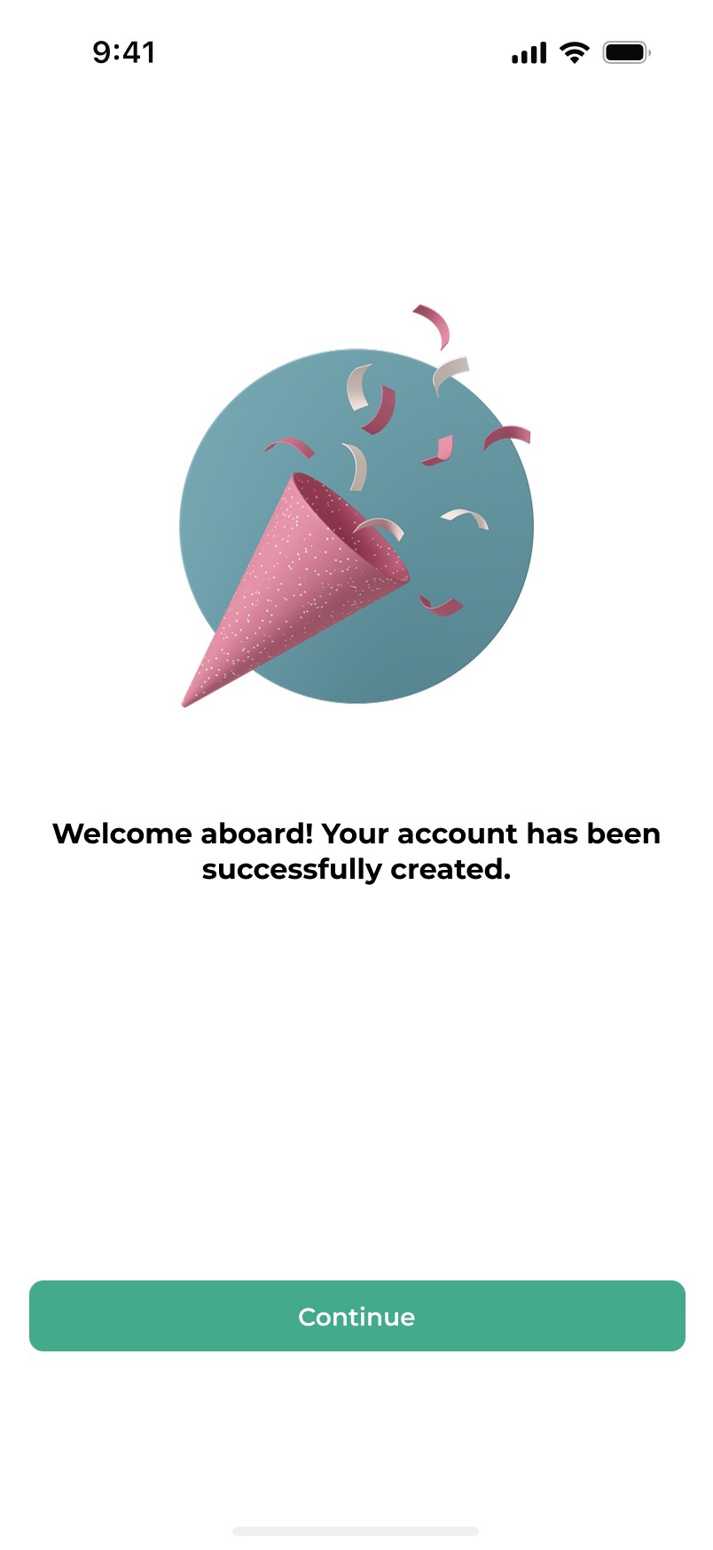
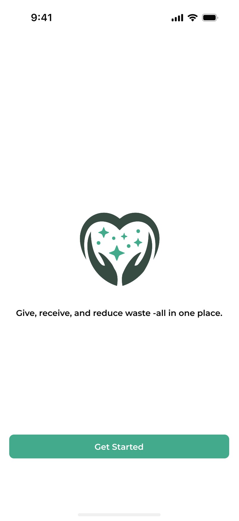


Rather than jumping straight to high fidelity, I built the prototype in three stages low, medium, and high each one fully wired end to end in Figma. Testing structure and flow early meant usability problems surfaced before a single pixel of visual polish was in place, and every layer of fidelity stayed testable on its own.

Low, medium, and high-fidelity flows fully connected in Figma for usability testing.
Usability Testing
I ran moderated usability tests on the high-fidelity prototype with 6 participants, split evenly between donors and recipients. Each person completed three core tasks: listing an item, requesting an item, and coordinating a pickup.
Donors hesitated at pickup step when no transport option was visible. Added an in-flow pickup-or-drop-off choice.
Recipients wanted trust signals before requesting, not after verification now appears earlier in the flow.
The multi-field listing form caused drop-off reduced to three required fields.
Users lost track of progress mid-listing a step indicator was added to keep them oriented.
Reflection
Share & Care taught me that the barrier to a good outcome is usually logistical, not motivational. People already wanted to donate the design work was about removing the reasons they couldn't.
The hardest part was designing for two users pulling in opposite directions. Donors want speed. Recipients want reassurance. Slow the flow down and trust improves, but donors drop off. Speed it up and donors stay, but trust erodes. Almost every meaningful decision in this project lived somewhere on that line.
Owning the project end to end research through design system through prototype also taught me to defend decisions with evidence, not preference. If a screen existed, I needed to be able to point to the research behind it.
More Projects

Tools:
UI / UX Design
Share & Care
Share & Care is a community-driven donation platform that makes giving away large household items simple, trusted, and genuinely local — removing the transport, time, and trust barriers that send reusable furniture to landfill.
Type :
Mobile App
Timeline :
2025
Context :
Solo Project
Role :
Product Design
Project Background
Share & Care started with something I see almost every day in my own community.
People leave usable furniture out on the kerb a sofa, a desk, a bookshelf. Sometimes a neighbour spots it and takes it home. More often it just sits there. It rains overnight, and by morning something perfectly good is swollen, stained, and on its way to landfill. The pattern is worst when people move out: they leave their things outside because there is nowhere obvious for them to go and no time to work it out.
What struck me was that none of this comes from a lack of goodwill. The person putting the sofa out wants someone to have it. Someone two streets away probably needs it. They just never find each other in time there is no information connecting them, and no easy way to move a sofa even if there were.
That gap between "I would rather donate this" and "I actually did" became the project. What followed was an end-to-end product design process: research, competitive analysis, personas, information architecture, a full design system, and a tested high-fidelity prototype built in Figma.
The Problem
Every year, millions of usable household items furniture, electronics, clothing end up in landfill. Not because people don't want to donate them, but because donating is harder than throwing them away.
Speaking with people who had recently moved, decluttered, or furnished a first apartment, the same three frictions surfaced again and again:
• Transportation — donors had large items but no realistic way to move them.
• Trust — no way to verify who was on the other side of the exchange.
• Time — existing platforms made listing and coordinating slow enough that people simply gave up.
PROBLEM STATEMENT
Many households want to donate unwanted furniture, electronics, and other large items but face significant barriers lack of transportation, time constraints, and uncertainty about where to donate. This leads to wasted resources and missed opportunities for reuse. By designing a user-centered mobile platform, I set out to bridge the gap between donors and recipients, making household donations more convenient, sustainable, and community-driven.
Research & Discovery
I looked at both sides of the exchange people with things to give away, and people looking for them. Journey and empathy mapping showed where intent broke down, and card sorting validated how users expected the product to be organised.
Through research I identified five core needs that kept surfacing across every session:
Easy donation process: Users wanted a simple way to list unwanted items and connect with recipients without jumping through hoops.
Transportation support: Many potential donors lacked vehicle access. Without a pickup option built into the platform, the donation would never happen.
Trust and security: Users needed verified profiles and reviews before they felt safe donating to or receiving from a stranger.
Local connections: Donors wanted to help people in their own communities — not faceless organizations miles away.
Smart notifications: Real-time alerts when someone nearby needed a specific item would actively push people to donate rather than wait.
KEY INSIGHT
People were not short on willingness. They were short on logistics.
Competitive Analysis
I audited four categories of existing platform to find where the real gap was.
Facebook Marketplace, Craigslist & OfferUp
Huge user base and local reac but no verification and no structured donation flow. Giving competes with selling.
Freecycle
Genuinely community-driven and free but a dated interface and no integrated pickup coordination.
Charity organizations
Goodwill, Habitat for Humanity ReStore, Salvation Army trusted and established, but require drop-offs or rigid scheduled pickups, and only accept certain categories.
Buy Nothing Project & Nextdoor
Hyperlocal and genuinely community-minded but run through Facebook groups and neighborhood feeds, with no listing structure, no matching, and no pickup coordination.
THE GAP
No platform combined a dedicated donation experience, easy listing, recipient matching, pickup coordination, and verified trust signals in one place. Every product solved one or two and left the rest to the user. That was the space Share & Care was designed to fill.
Who I Designed For
Research pointed to two users with opposite constraints and the product only works if both are satisfied inside the same flow.
PERSONA 01 — THE RECIPIENT
Priya Shah
Student · Suburban · Highly comfortable with technology
PERSONA 02 — THE DONOR
Sarah Mitchell
Teacher · Mother of two · Suburban · Comfortable with the basics
SUMMARY
Persona 1 – The Recipient
"I want free items nearby but I can't pick them up and I never know if the donor is trustworthy."
Looks for free furniture and household items locally. Loses items because there are no real-time alerts and has no way to verify donor credibility.
Persona 2 – The Donor
"I have things to give away but I'm too busy and have no easy way to donate large items."
Wants to donate regularly but existing platforms are too complicated, require drop-offs, and don't fit into her busy life.
Empathy Map
Design Goals
I translated the research into five goals that every design decision had to serve.
01 — Reduce household waste
Make reuse the easiest option rather than the hardest.
02 — Remove logistical friction
Transportation and scheduling could not be the user's problem to solve.
03 — Build community
Connect donors directly with nearby recipients.
04 — Establish trust
Identity verification, ratings, and secure coordination.
05 — Deliver real value
Convenience, clarity, and visible social impact.
These became a set of How Might We prompts
• How might we make it easier to donate large items without transportation barriers?
• How might we build trust and safety to encourage more users to participate?
• How might we connect donors directly with recipients in a meaningful local way?
• How might we show environmental and social impact to motivate donations?
• How might we reduce the time investment of a donation to under 15 minutes?
• How might we integrate a reliable pickup system to remove logistical challenges?
• How might we create a familiar platform that encourages first-time adoption?
Information Architecture
Once the design goals were set, I mapped the entire app as a sitemap before touching a single screen. Every flow from onboarding to reminders needed a clear home before it could be designed well.
Card sorting validated how users expected things to be grouped, and it shaped the final structure: eight top-level areas Welcome, Home, Search & Discovery, Donation Process, Communication, Profile & Settings, Map & Location Services, and Reminders & Alerts each self-contained but cross-linked wherever a task naturally spans more than one.
UX Laws I Applied
I made conscious decisions to apply established UX principles throughout the design.
Jakob's Law
Users expect platforms to work like ones they already know. I kept the interface familiar, using navigation patterns from marketplace apps users were already comfortable with.
Hick's Law
More choices means longer decisions. I stripped the donation flow down to three steps: upload item — select category choose pickup or drop-off.
Fitts's Law
Larger targets are faster to hit. I designed all key action buttons with tap targets sized for easy one-handed use.
Zeigarnik Effect
People are more likely to complete tasks they've already started. I added a progress indicator to the donation listing flow to motivate users to finish what they began.
Low Fidelity Wireframes
I started on paper, sketching every core flow by hand before touching a screen. From there, I built low-fidelity wireframes to map the primary user flow and pressure-test the screen structure early, before any visual decisions got in the way.
The goal at this stage wasn't polish it was clarity. Making sure the core experience felt simple, safe, and easy to follow before a single pixel of styling went in.
Landing page
Home
Browse
Item details
Upload an item
Fill details
History
Messages
Chatbox
Notifications
Design System & Branding
Every screen needed to feel like it came from the same hand. So before touching high fidelity, I distilled the product down to its smallest parts a mark, a palette, a type scale, an icon set, a set of reusable states turning consistency into a system rather than something I had to remember screen by screen.
High Fidelity Screens
With the system in place, I moved from structure to surface translating each wireframe into finished screens with real photography, clear condition and trust signals, and the visual polish that makes the flow feel ready to ship.
Rather than jumping straight to high fidelity, I built the prototype in three stages low, medium, and high each one fully wired end to end in Figma. Testing structure and flow early meant usability problems surfaced before a single pixel of visual polish was in place, and every layer of fidelity stayed testable on its own.
Low, medium, and high-fidelity flows fully connected in Figma for usability testing.
Usability Testing
I ran moderated usability tests on the high-fidelity prototype with 6 participants, split evenly between donors and recipients. Each person completed three core tasks: listing an item, requesting an item, and coordinating a pickup.
Donors hesitated at pickup step when no transport option was visible. Added an in-flow pickup-or-drop-off choice.
Recipients wanted trust signals before requesting, not after verification now appears earlier in the flow.
The multi-field listing form caused drop-off reduced to three required fields.
Users lost track of progress mid-listing a step indicator was added to keep them oriented.
Reflection
Share & Care taught me that the barrier to a good outcome is usually logistical, not motivational. People already wanted to donate the design work was about removing the reasons they couldn't.
The hardest part was designing for two users pulling in opposite directions. Donors want speed. Recipients want reassurance. Slow the flow down and trust improves, but donors drop off. Speed it up and donors stay, but trust erodes. Almost every meaningful decision in this project lived somewhere on that line.
Owning the project end to end research through design system through prototype also taught me to defend decisions with evidence, not preference. If a screen existed, I needed to be able to point to the research behind it.
More Projects
Tools:
UI / UX Design
Share & Care
Share & Care is a community-driven donation platform that makes giving away large household items simple, trusted, and genuinely local — removing the transport, time, and trust barriers that send reusable furniture to landfill.
Type :
Mobile App
Timeline :
2025
Context :
Solo Project
Role :
Product Design
Project Background
Share & Care started with something I see almost every day in my own community.
People leave usable furniture out on the kerb a sofa, a desk, a bookshelf. Sometimes a neighbour spots it and takes it home. More often it just sits there. It rains overnight, and by morning something perfectly good is swollen, stained, and on its way to landfill. The pattern is worst when people move out: they leave their things outside because there is nowhere obvious for them to go and no time to work it out.
What struck me was that none of this comes from a lack of goodwill. The person putting the sofa out wants someone to have it. Someone two streets away probably needs it. They just never find each other in time there is no information connecting them, and no easy way to move a sofa even if there were.
That gap between "I would rather donate this" and "I actually did" became the project. What followed was an end-to-end product design process: research, competitive analysis, personas, information architecture, a full design system, and a tested high-fidelity prototype built in Figma.
The Problem
Every year, millions of usable household items furniture, electronics, clothing end up in landfill. Not because people don't want to donate them, but because donating is harder than throwing them away.
Speaking with people who had recently moved, decluttered, or furnished a first apartment, the same three frictions surfaced again and again:
• Transportation — donors had large items but no realistic way to move them.
• Trust — no way to verify who was on the other side of the exchange.
• Time — existing platforms made listing and coordinating slow enough that people simply gave up.
PROBLEM STATEMENT
Many households want to donate unwanted furniture, electronics, and other large items but face significant barriers lack of transportation, time constraints, and uncertainty about where to donate. This leads to wasted resources and missed opportunities for reuse. By designing a user-centered mobile platform, I set out to bridge the gap between donors and recipients, making household donations more convenient, sustainable, and community-driven.
Research & Discovery
I looked at both sides of the exchange people with things to give away, and people looking for them. Journey and empathy mapping showed where intent broke down, and card sorting validated how users expected the product to be organised.
Through research I identified five core needs that kept surfacing across every session:
Easy donation process: Users wanted a simple way to list unwanted items and connect with recipients without jumping through hoops.
Transportation support: Many potential donors lacked vehicle access. Without a pickup option built into the platform, the donation would never happen.
Trust and security: Users needed verified profiles and reviews before they felt safe donating to or receiving from a stranger.
Local connections: Donors wanted to help people in their own communities — not faceless organizations miles away.
Smart notifications: Real-time alerts when someone nearby needed a specific item would actively push people to donate rather than wait.
KEY INSIGHT
People were not short on willingness. They were short on logistics.
Competitive Analysis
I audited four categories of existing platform to find where the real gap was.
Facebook Marketplace, Craigslist & OfferUp
Huge user base and local reac but no verification and no structured donation flow. Giving competes with selling.
Freecycle
Genuinely community-driven and free but a dated interface and no integrated pickup coordination.
Charity organizations
Goodwill, Habitat for Humanity ReStore, Salvation Army trusted and established, but require drop-offs or rigid scheduled pickups, and only accept certain categories.
Buy Nothing Project & Nextdoor
Hyperlocal and genuinely community-minded but run through Facebook groups and neighborhood feeds, with no listing structure, no matching, and no pickup coordination.
THE GAP
No platform combined a dedicated donation experience, easy listing, recipient matching, pickup coordination, and verified trust signals in one place. Every product solved one or two and left the rest to the user. That was the space Share & Care was designed to fill.
Who I Designed For
Research pointed to two users with opposite constraints and the product only works if both are satisfied inside the same flow.
PERSONA 01 — THE RECIPIENT
Priya Shah
Student · Suburban · Highly comfortable with technology
PERSONA 02 — THE DONOR
Sarah Mitchell
Teacher · Mother of two · Suburban · Comfortable with the basics
SUMMARY
Persona 1 – The Recipient
"I want free items nearby but I can't pick them up and I never know if the donor is trustworthy."
Looks for free furniture and household items locally. Loses items because there are no real-time alerts and has no way to verify donor credibility.
Persona 2 – The Donor
"I have things to give away but I'm too busy and have no easy way to donate large items."
Wants to donate regularly but existing platforms are too complicated, require drop-offs, and don't fit into her busy life.
Empathy Map
Design Goals
I translated the research into five goals that every design decision had to serve.
01 — Reduce household waste
Make reuse the easiest option rather than the hardest.
02 — Remove logistical friction
Transportation and scheduling could not be the user's problem to solve.
03 — Build community
Connect donors directly with nearby recipients.
04 — Establish trust
Identity verification, ratings, and secure coordination.
05 — Deliver real value
Convenience, clarity, and visible social impact.
These became a set of How Might We prompts
• How might we make it easier to donate large items without transportation barriers?
• How might we build trust and safety to encourage more users to participate?
• How might we connect donors directly with recipients in a meaningful local way?
• How might we show environmental and social impact to motivate donations?
• How might we reduce the time investment of a donation to under 15 minutes?
• How might we integrate a reliable pickup system to remove logistical challenges?
• How might we create a familiar platform that encourages first-time adoption?
Information Architecture
Once the design goals were set, I mapped the entire app as a sitemap before touching a single screen. Every flow from onboarding to reminders needed a clear home before it could be designed well.
Card sorting validated how users expected things to be grouped, and it shaped the final structure: eight top-level areas Welcome, Home, Search & Discovery, Donation Process, Communication, Profile & Settings, Map & Location Services, and Reminders & Alerts each self-contained but cross-linked wherever a task naturally spans more than one.
UX Laws I Applied
I made conscious decisions to apply established UX principles throughout the design.
Jakob's Law
Users expect platforms to work like ones they already know. I kept the interface familiar, using navigation patterns from marketplace apps users were already comfortable with.
Hick's Law
More choices means longer decisions. I stripped the donation flow down to three steps: upload item — select category choose pickup or drop-off.
Fitts's Law
Larger targets are faster to hit. I designed all key action buttons with tap targets sized for easy one-handed use.
Zeigarnik Effect
People are more likely to complete tasks they've already started. I added a progress indicator to the donation listing flow to motivate users to finish what they began.
Low Fidelity Wireframes
I started on paper, sketching every core flow by hand before touching a screen. From there, I built low-fidelity wireframes to map the primary user flow and pressure-test the screen structure early, before any visual decisions got in the way.
The goal at this stage wasn't polish it was clarity. Making sure the core experience felt simple, safe, and easy to follow before a single pixel of styling went in.
Landing page
Home
Browse
Item details
Upload an item
Fill details
History
Messages
Chatbox
Notifications
Design System & Branding
Every screen needed to feel like it came from the same hand. So before touching high fidelity, I distilled the product down to its smallest parts a mark, a palette, a type scale, an icon set, a set of reusable states turning consistency into a system rather than something I had to remember screen by screen.
High Fidelity Screens
With the system in place, I moved from structure to surface translating each wireframe into finished screens with real photography, clear condition and trust signals, and the visual polish that makes the flow feel ready to ship.
Rather than jumping straight to high fidelity, I built the prototype in three stages low, medium, and high each one fully wired end to end in Figma. Testing structure and flow early meant usability problems surfaced before a single pixel of visual polish was in place, and every layer of fidelity stayed testable on its own.
Low, medium, and high-fidelity flows fully connected in Figma for usability testing.
Usability Testing
I ran moderated usability tests on the high-fidelity prototype with 6 participants, split evenly between donors and recipients. Each person completed three core tasks: listing an item, requesting an item, and coordinating a pickup.
Donors hesitated at pickup step when no transport option was visible. Added an in-flow pickup-or-drop-off choice.
Recipients wanted trust signals before requesting, not after verification now appears earlier in the flow.
The multi-field listing form caused drop-off reduced to three required fields.
Users lost track of progress mid-listing a step indicator was added to keep them oriented.
Reflection
Share & Care taught me that the barrier to a good outcome is usually logistical, not motivational. People already wanted to donate the design work was about removing the reasons they couldn't.
The hardest part was designing for two users pulling in opposite directions. Donors want speed. Recipients want reassurance. Slow the flow down and trust improves, but donors drop off. Speed it up and donors stay, but trust erodes. Almost every meaningful decision in this project lived somewhere on that line.
Owning the project end to end research through design system through prototype also taught me to defend decisions with evidence, not preference. If a screen existed, I needed to be able to point to the research behind it.
More Projects
Tools: