UI / UX Design
AroundUs
AroundUs is a location-based iOS app that helps relocated people turn physical proximity into real connection — by joining nearby strangers in simple shared activities like walking, coffee, or studying, instead of swiping profiles or starting conversations.
Type :
iOS App (SwiftUI)
Timeline :
2025 – 2026
Context :
MA Capstone
Role :
Design & Development

Project Background & Personal Journey
As an international student, moving to a new place meant being surrounded by people but still doing most things alone. I would see the same faces around campus, in libraries, cafés, and shared spaces, but there was rarely a natural reason to start a conversation.
AroundUs came from that gap between being nearby and actually feeling connected. The app helps people take the first step through small, low-pressure activities like coffee, walks, study sessions, or groceries.
Instead of forcing awkward messages or big events, AroundUs creates simple moments where connection can begin naturally.
Problem Statement
Newcomers and people in unfamiliar communities are often surrounded by others but still struggle to form real connections. Existing social apps focus on profiles, messaging, or planned events, which can feel awkward, high-pressure, or too much commitment. There is a need for a simpler way to turn everyday proximity into low-pressure social interaction.
HOW MIGHT WE
How might we help people in a new place connect with others nearby through small, everyday activities instead of awkward conversations or high-commitment events?
Understanding the Gap
To understand why nearby people still struggle to connect, I looked at loneliness, newcomer adaptation, and the limitations of existing social platforms. The research helped me shift the project away from “finding people” and toward creating low-pressure moments for connection.
Nearby doesn’t mean connected
People can share the same spaces every day but still lack a natural reason to talk.
Profiles create pressure
Profile-first apps ask users to judge and present themselves before any real interaction happens.
Small actions lower the barrier
A walk, coffee, or study session gives people a reason to meet without forcing awkward conversation.
Why Existing Platforms Fall Short
Most platforms help people broadcast, match, or attend events. But they rarely help nearby strangers turn everyday routines into low-pressure connection.
Broadcast
People can see content, but still not meet.
Profile Matching
Users must judge and present themselves first.
Events
Requires time, planning, and commitment.
Nearby Activities
Small actions create a natural reason to connect.
Design Opportunity
The opportunity was not to build another social network. It was to design a smaller first step.
Instead of asking people to browse profiles, send awkward messages, or commit to big events, AroundUs starts with something simple: what people nearby are already open to doing.
Card Sorts & Affinity Mapping
To make sense of the research, I grouped recurring insights into three themes: pain points, desires, and behaviors. This helped clarify what AroundUs needed to reduce, support, and respond to.
The strongest pattern was clear: users did not need another social feed. They needed a safer, simpler reason to connect with people nearby.

Persona, Task Flow & User Journey
The affinity map helped shape a clearer user scenario: a newcomer who wants connection, but does not want the pressure of messaging strangers or attending large events. I used this to map the user's journey from feeling alone nearby to taking a small first step through an activity.

ALONE
Doing everyday routines alone.
CURIOUS
Sees people nearby doing similar activities.
COMFORTABLE
Joins through a small shared activity.
CONNECTED
Meets, chats, and builds familiarity.
Open app
→
See nearby activity
→
Choose Talk or Join
→
Send request
→
Temporary chat
→
Meet in real life
The Journey Behind the Design
Design is messy
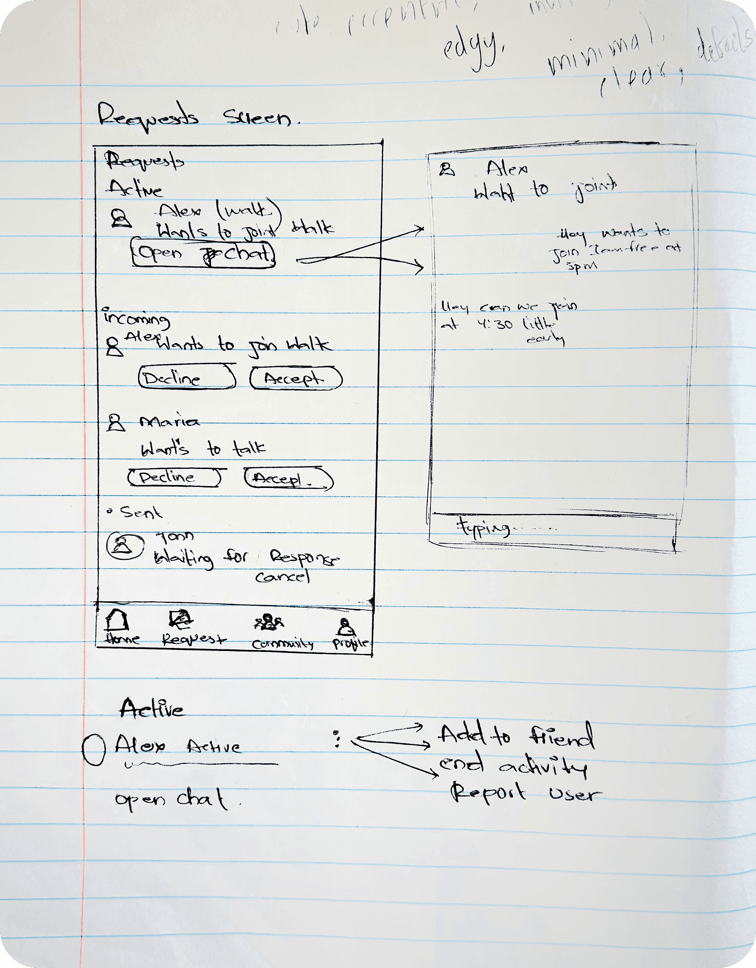
The final product looks simple, but the path to get there was messy. Early ideas explored empathy prompts, interest-based matching, walking companions, and messaging support. Each direction revealed something useful, but also added friction. The strongest version emerged when I simplified the problem: connection should begin with a small shared activity, not a profile or an open-ended conversation.

(04)

(05)

(03)
(02)

(01)
Wireframes & Early Structure
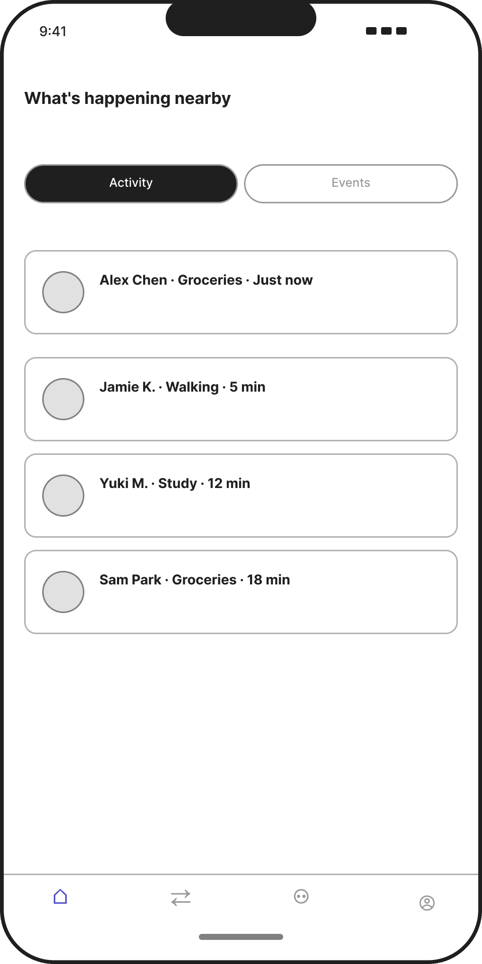
After narrowing the concept, I began translating the activity-first model into a clear app structure. Before designing the final screens, I went through an ideation phase using white paper sketches and brainstorming to explore the best user journey for AroundUs. I focused on questions such as: how should nearby people and activities appear, where should activity and event cards live, how should users send and manage requests, and how could temporary chat support coordination before users decide to stay connected?
This phase helped me map the main user flow and make better decisions about the screen structure. The goal was not visual polish yet, but clarity: making sure the core experience felt simple, safe, and easy to follow. Through this process, I defined the main loop of AroundUs: discover, request, chat, meet, and stay connected.
Low Fidelity Wireframes



Usability Testing
Testing whether the activity-first flow felt clear
After defining the main user flow, I conducted moderated usability testing with relocated students to understand whether the activity-first model felt clear, approachable, and easy to use. The sessions focused on how users interpreted the radar home, explored nearby interaction options, browsed the activity feed, posted a new activity, changed their registered location, and located an event detail view.
The goal was to observe whether users could move through the core AroundUs experience without heavy explanation. Testing helped reveal what felt intuitive, where users hesitated, and how the design could better support low-pressure connection through nearby activities.
Testing Setup
Participants
3 relocated students
Format
Moderated remote sessions
Tasks
6 scripted tasks
Focus
Clarity, desirability, task completion, emotional response
Tasks Tested
01
Interpret the radar home
02
Explore nearby interaction options
03
Browse the activity feed
04
Post a new activity
05
Change registered location
06
Locate an event detail view
Key Testing Insights
The usability testing sessions helped confirm that the AroundUs user flow and interface were easy to understand. Most participants were able to move through the core experience successfully and responded positively to the idea of nearby, activity-based connection.
STRONGEST FEEDBACK
Users could see themselves using this kind of app in real life. They liked that AroundUs made connection feel more natural and low-pressure, especially because it started with a specific activity instead of a profile or open-ended conversation.
Testing also helped identify small areas to refine, including the activity creation flow, the activity/event distinction, and request visibility.
Final Product
From onboarding to real-world connection
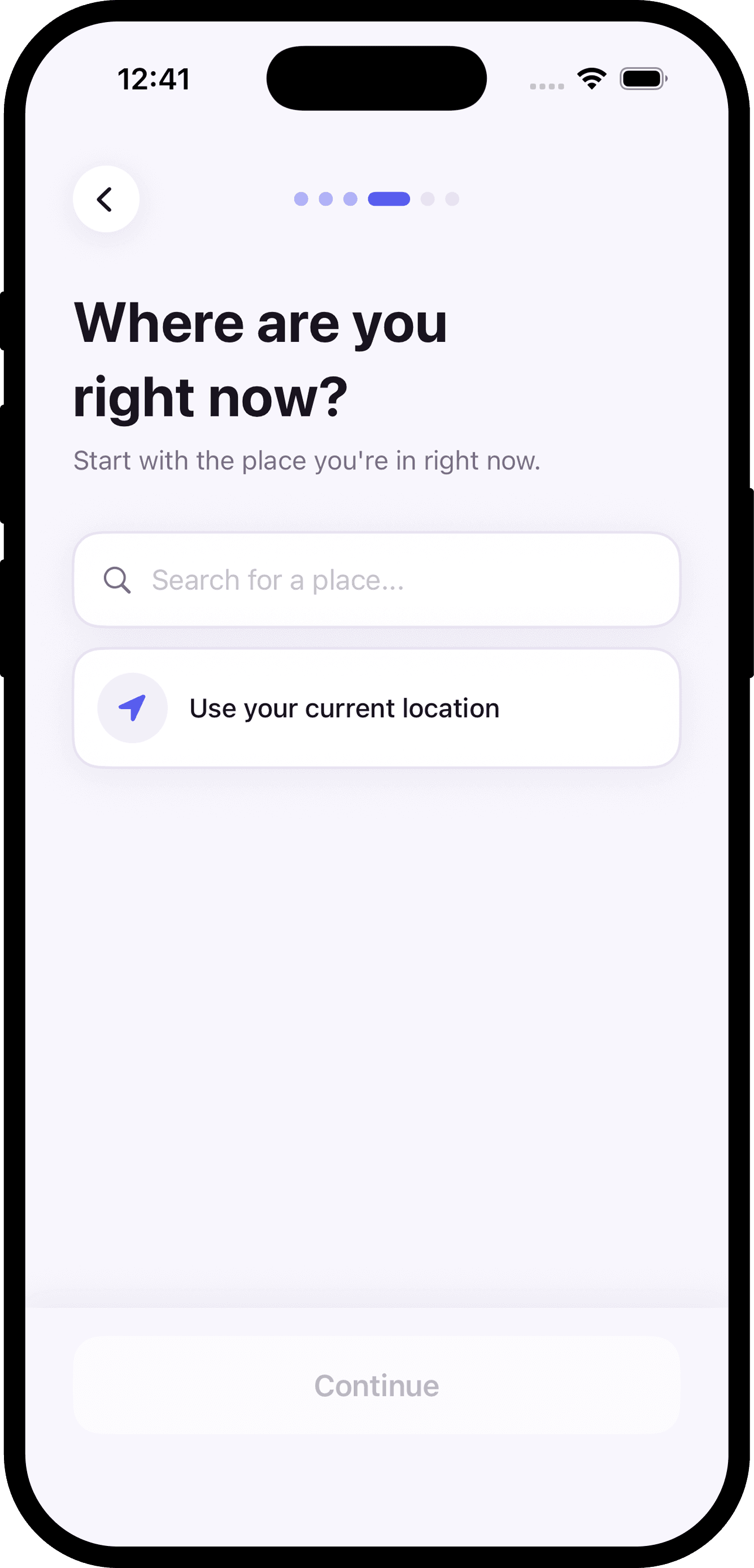
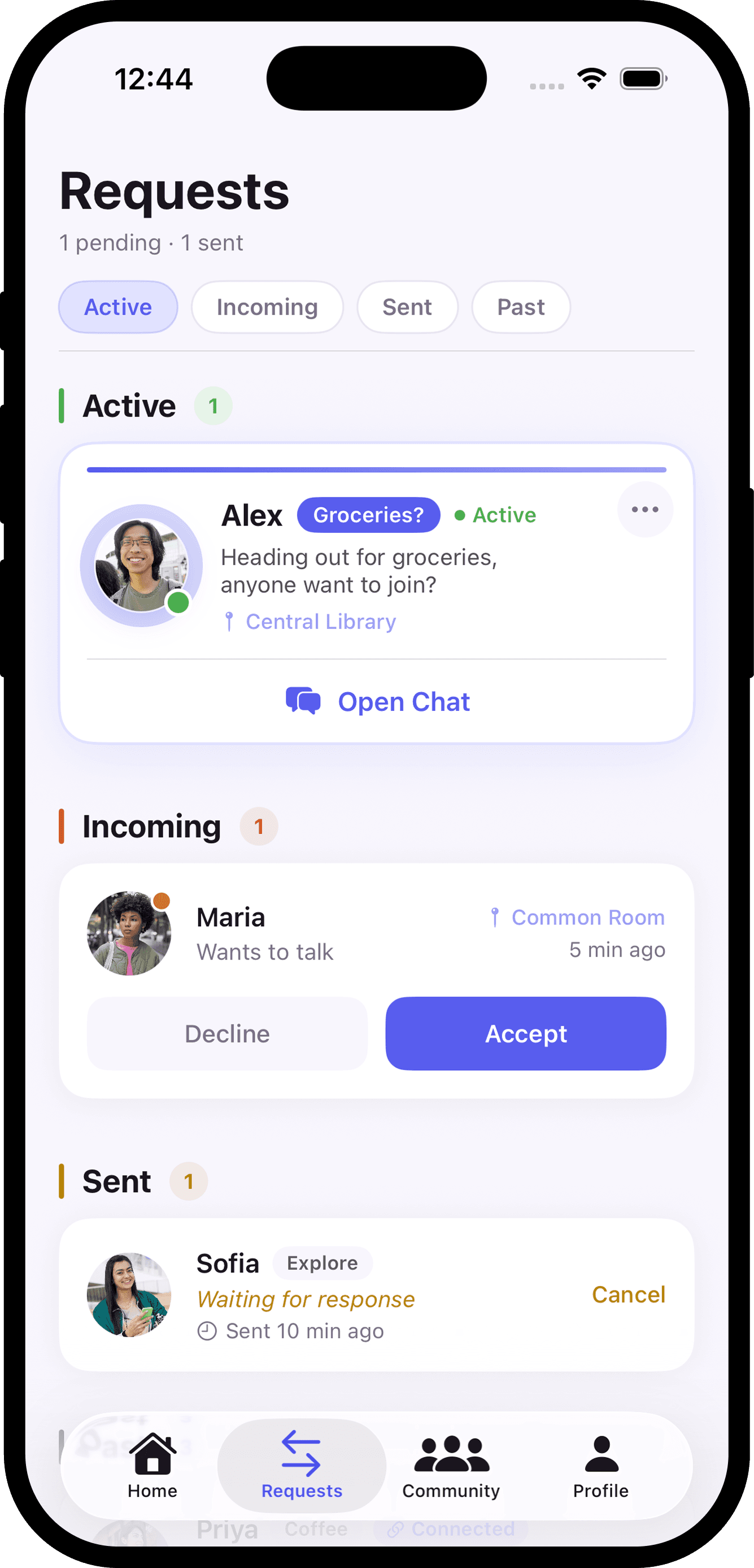
The final AroundUs experience guides users from setup to nearby connection through a simple, activity-first flow. Onboarding helps users define where they are, what they are open to doing, and how they want to present themselves.
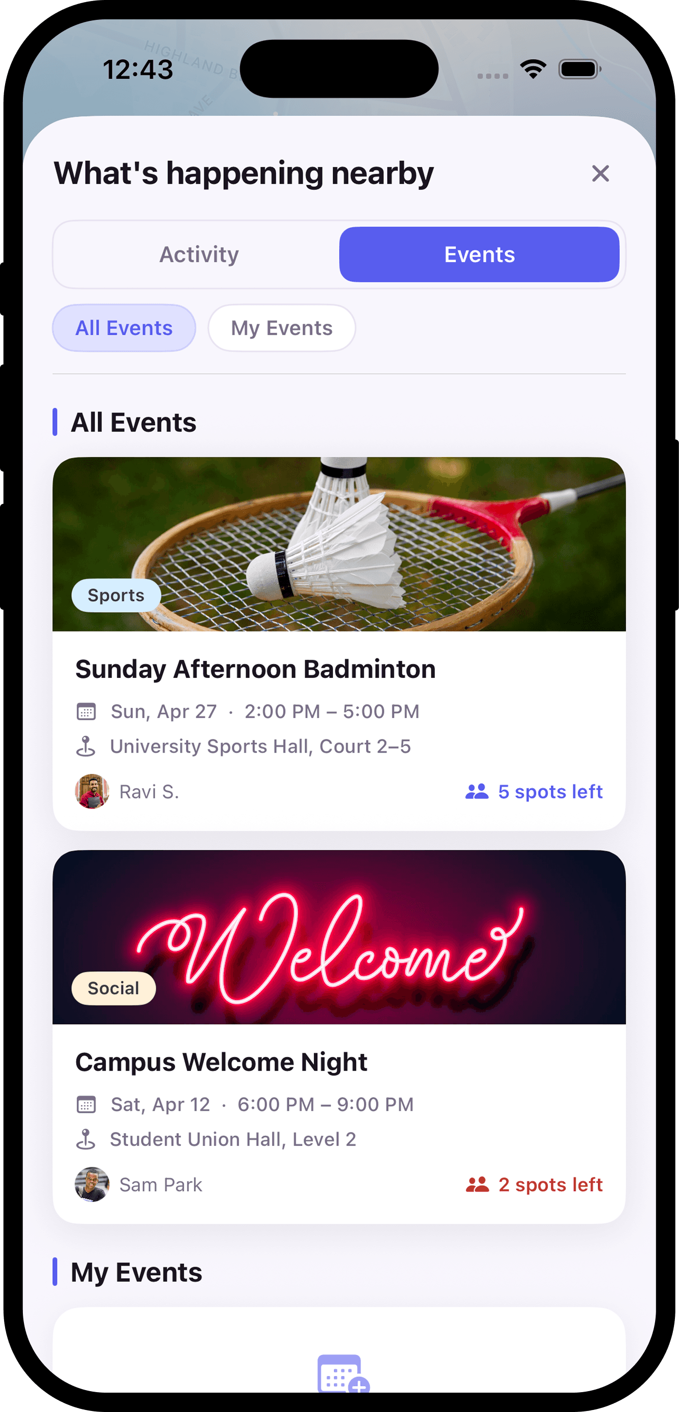
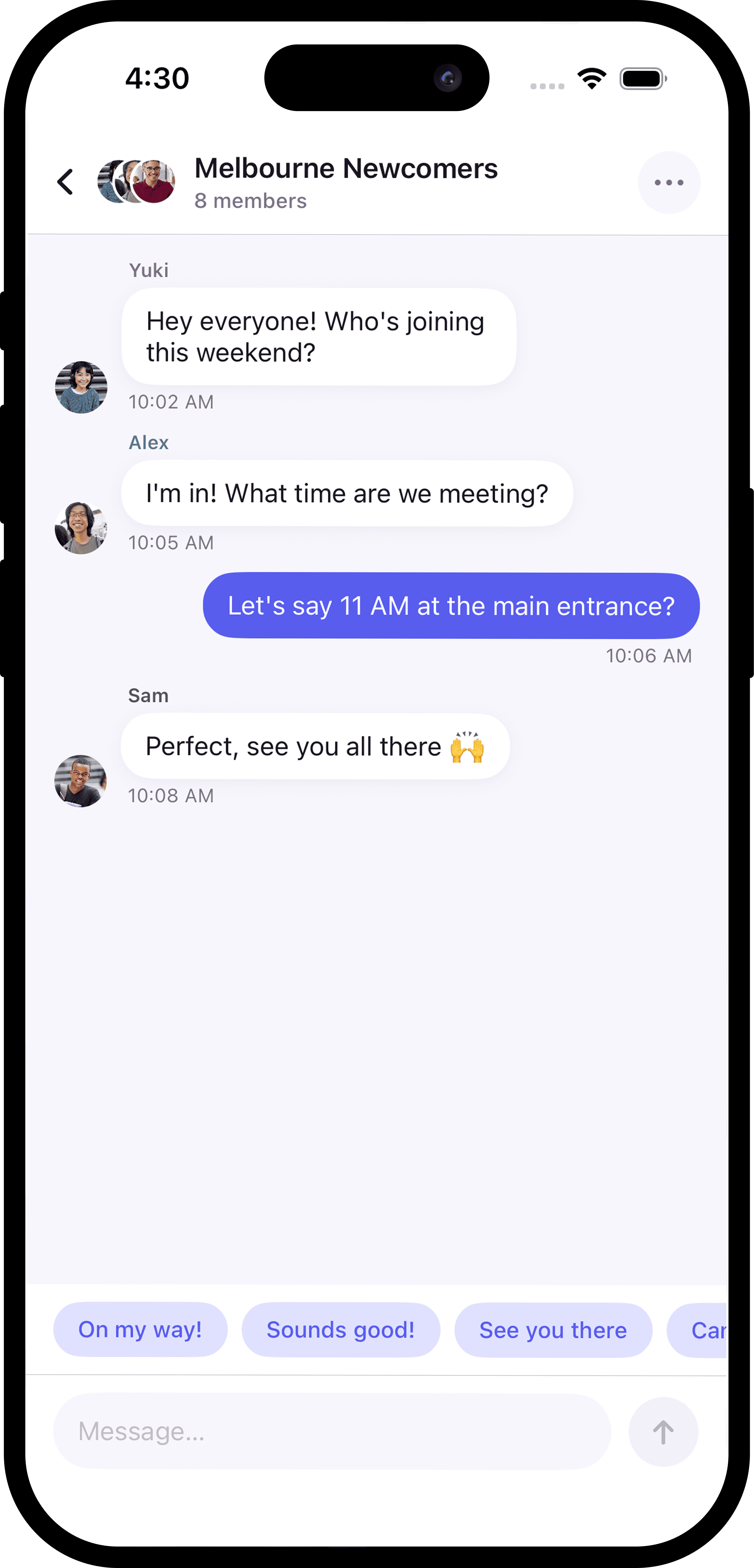
The main app flow then supports the full connection journey: discovering nearby people and activities, sending requests, coordinating through temporary chat, and staying connected only when the interaction feels right.
Onboarding Flow




Main App Flow








Prototype Build with Claude Code + Xcode
To build the interactive prototype, I used Claude Code as part of a vibe coding workflow for frontend development in Xcode. After exploring the product flow through white paper sketches and Figma concepts, I translated the AroundUs experience into a working SwiftUI prototype.
Claude Code supported the generation and organization of SwiftUI views, components, and interaction logic. I used Xcode to run the prototype, test navigation, adjust screen states, and evaluate how the experience worked on an iOS simulator.

SwiftUI implementation in Xcode showing the AroundUs prototype running with simulated app data.
White paper sketches
→
Figma concepts
→
Claude Code / vibe coding
→
SwiftUI prototype
Prototype
AroundUs Prototype
This walkthrough presents the high-fidelity version of the core AroundUs experience, built from insights gathered through research, ideation, and usability testing.
What I Learned
This project taught me that designing for connection is not only about adding more features or more ways to communicate. It is about reducing the pressure around the first step. Through research, ideation, usability testing, and prototyping, I learned that small shared activities can make interaction feel more natural, especially for people who are new to a place.I also learned how to move from emotional research insights into product structure. AroundUs helped me understand how user needs can shape flows, screen hierarchy, interaction states, and the overall rhythm of a product experience.
Final Reflection
AroundUs began from a personal feeling of being surrounded by people but still feeling disconnected. Over time, the project became a way to explore how design can create gentle openings for real-world connection.
The final outcome is not about forcing people to socialize. It is about making connection feel possible through simple, everyday moments coffee, study, walks, groceries, or shared routines. AroundUs turns nearby presence into a smaller, safer first step toward belonging.
More Projects

Tools:
UI / UX Design
AroundUs
AroundUs is a location-based iOS app that helps relocated people turn physical proximity into real connection — by joining nearby strangers in simple shared activities like walking, coffee, or studying, instead of swiping profiles or starting conversations.
Type :
iOS App (SwiftUI)
Timeline :
2025 – 2026
Context :
MA Capstone
Role :
Design & Development
Project Background & Personal Journey
As an international student, moving to a new place meant being surrounded by people but still doing most things alone. I would see the same faces around campus, in libraries, cafés, and shared spaces, but there was rarely a natural reason to start a conversation.
AroundUs came from that gap between being nearby and actually feeling connected. The app helps people take the first step through small, low-pressure activities like coffee, walks, study sessions, or groceries.
Instead of forcing awkward messages or big events, AroundUs creates simple moments where connection can begin naturally.
Problem Statement
Newcomers and people in unfamiliar communities are often surrounded by others but still struggle to form real connections. Existing social apps focus on profiles, messaging, or planned events, which can feel awkward, high-pressure, or too much commitment. There is a need for a simpler way to turn everyday proximity into low-pressure social interaction.
HOW MIGHT WE
How might we help people in a new place connect with others nearby through small, everyday activities instead of awkward conversations or high-commitment events?
Understanding the Gap
To understand why nearby people still struggle to connect, I looked at loneliness, newcomer adaptation, and the limitations of existing social platforms. The research helped me shift the project away from “finding people” and toward creating low-pressure moments for connection.
Nearby doesn’t mean connected
People can share the same spaces every day but still lack a natural reason to talk.
Profiles create pressure
Profile-first apps ask users to judge and present themselves before any real interaction happens.
Small actions lower the barrier
A walk, coffee, or study session gives people a reason to meet without forcing awkward conversation.
Why Existing Platforms Fall Short
Most platforms help people broadcast, match, or attend events. But they rarely help nearby strangers turn everyday routines into low-pressure connection.
Broadcast
People can see content, but still not meet.
Profile Matching
Users must judge and present themselves first.
Events
Requires time, planning, and commitment.
Nearby Activities
Small actions create a natural reason to connect.
Design Opportunity
The opportunity was not to build another social network. It was to design a smaller first step.
Instead of asking people to browse profiles, send awkward messages, or commit to big events, AroundUs starts with something simple: what people nearby are already open to doing.
Card Sorts & Affinity Mapping
To make sense of the research, I grouped recurring insights into three themes: pain points, desires, and behaviors. This helped clarify what AroundUs needed to reduce, support, and respond to.
The strongest pattern was clear: users did not need another social feed. They needed a safer, simpler reason to connect with people nearby.
Persona, Task Flow & User Journey
The affinity map helped shape a clearer user scenario: a newcomer who wants connection, but does not want the pressure of messaging strangers or attending large events. I used this to map the user's journey from feeling alone nearby to taking a small first step through an activity.
ALONE
Doing everyday routines alone.
CURIOUS
Sees people nearby doing similar activities.
COMFORTABLE
Joins through a small shared activity.
CONNECTED
Meets, chats, and builds familiarity.
Open app
→
See nearby activity
→
Choose Talk or Join
→
Send request
→
Temporary chat
→
Meet in real life
The Journey Behind the Design
Design is messy
The final product looks simple, but the path to get there was messy. Early ideas explored empathy prompts, interest-based matching, walking companions, and messaging support. Each direction revealed something useful, but also added friction. The strongest version emerged when I simplified the problem: connection should begin with a small shared activity, not a profile or an open-ended conversation.
(04)
(05)
(03)
(02)
(01)
Wireframes & Early Structure
After narrowing the concept, I began translating the activity-first model into a clear app structure. Before designing the final screens, I went through an ideation phase using white paper sketches and brainstorming to explore the best user journey for AroundUs. I focused on questions such as: how should nearby people and activities appear, where should activity and event cards live, how should users send and manage requests, and how could temporary chat support coordination before users decide to stay connected?
This phase helped me map the main user flow and make better decisions about the screen structure. The goal was not visual polish yet, but clarity: making sure the core experience felt simple, safe, and easy to follow. Through this process, I defined the main loop of AroundUs: discover, request, chat, meet, and stay connected.
Low Fidelity Wireframes
Usability Testing
Testing whether the activity-first flow felt clear
After defining the main user flow, I conducted moderated usability testing with relocated students to understand whether the activity-first model felt clear, approachable, and easy to use. The sessions focused on how users interpreted the radar home, explored nearby interaction options, browsed the activity feed, posted a new activity, changed their registered location, and located an event detail view.
The goal was to observe whether users could move through the core AroundUs experience without heavy explanation. Testing helped reveal what felt intuitive, where users hesitated, and how the design could better support low-pressure connection through nearby activities.
Testing Setup
Participants
3 relocated students
Format
Moderated remote sessions
Tasks
6 scripted tasks
Focus
Clarity, desirability, task completion, emotional response
Tasks Tested
01
Interpret the radar home
02
Explore nearby interaction options
03
Browse the activity feed
04
Post a new activity
05
Change registered location
06
Locate an event detail view
Key Testing Insights
The usability testing sessions helped confirm that the AroundUs user flow and interface were easy to understand. Most participants were able to move through the core experience successfully and responded positively to the idea of nearby, activity-based connection.
STRONGEST FEEDBACK
Users could see themselves using this kind of app in real life. They liked that AroundUs made connection feel more natural and low-pressure, especially because it started with a specific activity instead of a profile or open-ended conversation.
Testing also helped identify small areas to refine, including the activity creation flow, the activity/event distinction, and request visibility.
Final Product
From onboarding to real-world connection
The final AroundUs experience guides users from setup to nearby connection through a simple, activity-first flow. Onboarding helps users define where they are, what they are open to doing, and how they want to present themselves.
The main app flow then supports the full connection journey: discovering nearby people and activities, sending requests, coordinating through temporary chat, and staying connected only when the interaction feels right.
Onboarding Flow
Main App Flow
Prototype Build with Claude Code + Xcode
To build the interactive prototype, I used Claude Code as part of a vibe coding workflow for frontend development in Xcode. After exploring the product flow through white paper sketches and Figma concepts, I translated the AroundUs experience into a working SwiftUI prototype.
Claude Code supported the generation and organization of SwiftUI views, components, and interaction logic. I used Xcode to run the prototype, test navigation, adjust screen states, and evaluate how the experience worked on an iOS simulator.
SwiftUI implementation in Xcode showing the AroundUs prototype running with simulated app data.
White paper sketches
→
Figma concepts
→
Claude Code / vibe coding
→
SwiftUI prototype
Prototype
AroundUs Prototype
This walkthrough presents the high-fidelity version of the core AroundUs experience, built from insights gathered through research, ideation, and usability testing.
What I Learned
This project taught me that designing for connection is not only about adding more features or more ways to communicate. It is about reducing the pressure around the first step. Through research, ideation, usability testing, and prototyping, I learned that small shared activities can make interaction feel more natural, especially for people who are new to a place.I also learned how to move from emotional research insights into product structure. AroundUs helped me understand how user needs can shape flows, screen hierarchy, interaction states, and the overall rhythm of a product experience.
Final Reflection
AroundUs began from a personal feeling of being surrounded by people but still feeling disconnected. Over time, the project became a way to explore how design can create gentle openings for real-world connection.
The final outcome is not about forcing people to socialize. It is about making connection feel possible through simple, everyday moments coffee, study, walks, groceries, or shared routines. AroundUs turns nearby presence into a smaller, safer first step toward belonging.
More Projects
Tools:
UI / UX Design
AroundUs
AroundUs is a location-based iOS app that helps relocated people turn physical proximity into real connection — by joining nearby strangers in simple shared activities like walking, coffee, or studying, instead of swiping profiles or starting conversations.
Type :
iOS App (SwiftUI)
Timeline :
2025 – 2026
Context :
MA Capstone
Role :
Design & Development
Project Background & Personal Journey
As an international student, moving to a new place meant being surrounded by people but still doing most things alone. I would see the same faces around campus, in libraries, cafés, and shared spaces, but there was rarely a natural reason to start a conversation.
AroundUs came from that gap between being nearby and actually feeling connected. The app helps people take the first step through small, low-pressure activities like coffee, walks, study sessions, or groceries.
Instead of forcing awkward messages or big events, AroundUs creates simple moments where connection can begin naturally.
Problem Statement
Newcomers and people in unfamiliar communities are often surrounded by others but still struggle to form real connections. Existing social apps focus on profiles, messaging, or planned events, which can feel awkward, high-pressure, or too much commitment. There is a need for a simpler way to turn everyday proximity into low-pressure social interaction.
HOW MIGHT WE
How might we help people in a new place connect with others nearby through small, everyday activities instead of awkward conversations or high-commitment events?
Understanding the Gap
To understand why nearby people still struggle to connect, I looked at loneliness, newcomer adaptation, and the limitations of existing social platforms. The research helped me shift the project away from “finding people” and toward creating low-pressure moments for connection.
Nearby doesn’t mean connected
People can share the same spaces every day but still lack a natural reason to talk.
Profiles create pressure
Profile-first apps ask users to judge and present themselves before any real interaction happens.
Small actions lower the barrier
A walk, coffee, or study session gives people a reason to meet without forcing awkward conversation.
Why Existing Platforms Fall Short
Most platforms help people broadcast, match, or attend events. But they rarely help nearby strangers turn everyday routines into low-pressure connection.
Broadcast
People can see content, but still not meet.
Profile Matching
Users must judge and present themselves first.
Events
Requires time, planning, and commitment.
Nearby Activities
Small actions create a natural reason to connect.
Design Opportunity
The opportunity was not to build another social network. It was to design a smaller first step.
Instead of asking people to browse profiles, send awkward messages, or commit to big events, AroundUs starts with something simple: what people nearby are already open to doing.
Card Sorts & Affinity Mapping
To make sense of the research, I grouped recurring insights into three themes: pain points, desires, and behaviors. This helped clarify what AroundUs needed to reduce, support, and respond to.
The strongest pattern was clear: users did not need another social feed. They needed a safer, simpler reason to connect with people nearby.
Persona, Task Flow & User Journey
The affinity map helped shape a clearer user scenario: a newcomer who wants connection, but does not want the pressure of messaging strangers or attending large events. I used this to map the user's journey from feeling alone nearby to taking a small first step through an activity.
ALONE
Doing everyday routines alone.
CURIOUS
Sees people nearby doing similar activities.
COMFORTABLE
Joins through a small shared activity.
CONNECTED
Meets, chats, and builds familiarity.
Open app
→
See nearby activity
→
Choose Talk or Join
→
Send request
→
Temporary chat
→
Meet in real life
The Journey Behind the Design
Design is messy
The final product looks simple, but the path to get there was messy. Early ideas explored empathy prompts, interest-based matching, walking companions, and messaging support. Each direction revealed something useful, but also added friction. The strongest version emerged when I simplified the problem: connection should begin with a small shared activity, not a profile or an open-ended conversation.
(04)
(05)
(03)
(02)
(01)
Wireframes & Early Structure
After narrowing the concept, I began translating the activity-first model into a clear app structure. Before designing the final screens, I went through an ideation phase using white paper sketches and brainstorming to explore the best user journey for AroundUs. I focused on questions such as: how should nearby people and activities appear, where should activity and event cards live, how should users send and manage requests, and how could temporary chat support coordination before users decide to stay connected?
This phase helped me map the main user flow and make better decisions about the screen structure. The goal was not visual polish yet, but clarity: making sure the core experience felt simple, safe, and easy to follow. Through this process, I defined the main loop of AroundUs: discover, request, chat, meet, and stay connected.
Low Fidelity Wireframes
Usability Testing
Testing whether the activity-first flow felt clear
After defining the main user flow, I conducted moderated usability testing with relocated students to understand whether the activity-first model felt clear, approachable, and easy to use. The sessions focused on how users interpreted the radar home, explored nearby interaction options, browsed the activity feed, posted a new activity, changed their registered location, and located an event detail view.
The goal was to observe whether users could move through the core AroundUs experience without heavy explanation. Testing helped reveal what felt intuitive, where users hesitated, and how the design could better support low-pressure connection through nearby activities.
Testing Setup
Participants
3 relocated students
Format
Moderated remote sessions
Tasks
6 scripted tasks
Focus
Clarity, desirability, task completion, emotional response
Tasks Tested
01
Interpret the radar home
02
Explore nearby interaction options
03
Browse the activity feed
04
Post a new activity
05
Change registered location
06
Locate an event detail view
Key Testing Insights
The usability testing sessions helped confirm that the AroundUs user flow and interface were easy to understand. Most participants were able to move through the core experience successfully and responded positively to the idea of nearby, activity-based connection.
STRONGEST FEEDBACK
Users could see themselves using this kind of app in real life. They liked that AroundUs made connection feel more natural and low-pressure, especially because it started with a specific activity instead of a profile or open-ended conversation.
Testing also helped identify small areas to refine, including the activity creation flow, the activity/event distinction, and request visibility.
Final Product
From onboarding to real-world connection
The final AroundUs experience guides users from setup to nearby connection through a simple, activity-first flow. Onboarding helps users define where they are, what they are open to doing, and how they want to present themselves.
The main app flow then supports the full connection journey: discovering nearby people and activities, sending requests, coordinating through temporary chat, and staying connected only when the interaction feels right.
Onboarding Flow
Main App Flow
Prototype Build with Claude Code + Xcode
To build the interactive prototype, I used Claude Code as part of a vibe coding workflow for frontend development in Xcode. After exploring the product flow through white paper sketches and Figma concepts, I translated the AroundUs experience into a working SwiftUI prototype.
Claude Code supported the generation and organization of SwiftUI views, components, and interaction logic. I used Xcode to run the prototype, test navigation, adjust screen states, and evaluate how the experience worked on an iOS simulator.
SwiftUI implementation in Xcode showing the AroundUs prototype running with simulated app data.
White paper sketches
→
Figma concepts
→
Claude Code / vibe coding
→
SwiftUI prototype
Prototype
AroundUs Prototype
This walkthrough presents the high-fidelity version of the core AroundUs experience, built from insights gathered through research, ideation, and usability testing.
What I Learned
This project taught me that designing for connection is not only about adding more features or more ways to communicate. It is about reducing the pressure around the first step. Through research, ideation, usability testing, and prototyping, I learned that small shared activities can make interaction feel more natural, especially for people who are new to a place.I also learned how to move from emotional research insights into product structure. AroundUs helped me understand how user needs can shape flows, screen hierarchy, interaction states, and the overall rhythm of a product experience.
Final Reflection
AroundUs began from a personal feeling of being surrounded by people but still feeling disconnected. Over time, the project became a way to explore how design can create gentle openings for real-world connection.
The final outcome is not about forcing people to socialize. It is about making connection feel possible through simple, everyday moments coffee, study, walks, groceries, or shared routines. AroundUs turns nearby presence into a smaller, safer first step toward belonging.
More Projects
Tools: